Showing posts with label color. Show all posts

Monday, April 2, 2012

Vacation Inspiration

Getting back to blogging after a vacation with the family to Mexico.

While I was there, 
I could not help but be inspired.  
There were so many interesting design elements at the resort..from the use of color combinations, different textures,
and the use of different materials.

Unfortunately I am a little and at myself that I missed photographing some of the things I wanted to because my bathing suit did not have a pocket to hold my camera, and taking photos would have required that 
I set down my margarita.  

I did, however, take some photos to share that feature beautiful color I found with the landscaping.  
The color of the water, sky, flowers, greenery, mixed with the texture of the palm trees and 
tropical foliage was so beautiful.   
     

I loved all the different shades of blue next to one another...the colors of the ocean were my most favorite shades.

 These little flowers caught my eye.   I loved the grey of the twig mixed with the citrus green and the variety of 
pink and coral in the flowers.
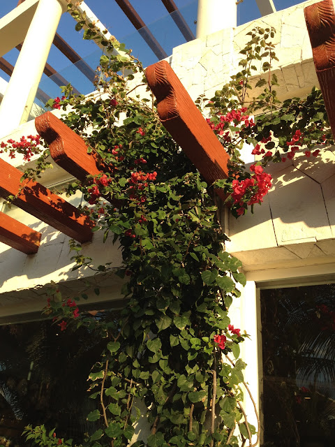
 I love the contrast of color with the cream wall, rich wood tone, and the 
green and red in the floral.    


This climbing floral was stunning in person...have to have this color in my home after seeing these.  
 ...Loved the texture of the palm trees
 I thought these were so simple and loved the long green leaves.
I found that nature and especially the colors so inspiring to use in my design work.

Tuesday, January 24, 2012

Tips for Mixing Patterns and Color


One thing I do the most for clients is assist in coordinating fabrics. I thought I would share a few tips I share with clients that make the process less intimidating.  

Below is a pattern that has what I call "movement."   Patterns with movement have a free flowing effect...
a floral is a good example. 
 Here is another example of a pattern with movement.   I would use these two patterns in the same room.   When mixing more than one pattern that has movement, it is important that they contrast in pattern and scale.   Then they look good together. You use color to connect the patterns...both of these patterns have blue and gold.   

 The next type of pattern I like to add is a pattern that feels geometric.   This could be a herring bone pattern, stripes, polka dots....

 Some patterns are "tone on tone" like the one below.  This one looks solid blue from a  distance...that is a good way to know if you are looking at a tone on tone pattern.  
 Then there are ones that incorporate both a geometric and movement.  This one I would consider to be more geometric because of it's symmetry...but patterns like these can work for either effect sometimes. 
So my general rule is to mix:
patterns with movement
patterns that are geometric
and
patterns that are solid or tone on tone

It always feel more balanced with adding all 3 types into your decor.  These patterns can show up on window treatments, rugs, throw pillows, artwork,and in your accessories.

One rule to remember that when mixing more than one pattern type...add a contrast through color and scale. Also remember to connect the color story by repeating the colors in your fabrics. 

Hopefully these tips will help when mixing patterns and colors....
This is one of my favorite things to do!


Wednesday, November 23, 2011

Fall Vinette

Ready to pull out all the Christmas stuff...so I thought I'd show a little bit of fall decor before I put it away.  This is an area in my dining room that is also the first wall you see when you enter my home.  I change this area the most for the seasonal decorating.   
 I have used a variety of accessories...lamp, vase with twigs for texture, pumpkin and gourds for color, placemat for color and texture, and an old camera for fun.  I also added some vintage round silk and velvet pillows to the side chairs.
 I love to mix metals.   Here I mixed a gold mirror with a pewter/silver vase.   
 I have a bar area in the corner and added a wreath and indian corn.  
Happy Thanksgiving!

Tuesday, November 22, 2011

Redesign / One Day Decorating

Here are some before and after shots of a redesign I did for a client.   A Redesign is all about using your  existing furniture and accessories. My client had lots of great things to work with and treasures we pulled out of closets. My goal was to add some color and tweak some of the issues with space planning.   We worked on a living room, dining room, master bedroom, sitting room and office.   We swapped items from room to room and had some dramatic changes in a short period of time.   

Master Bedroom Reading Area
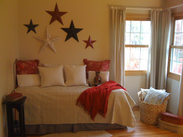
This area felt like an extra twin bed that had no where to go.   I wanted to make it feel more like a day bed or sofa.   The area is used for reading and relaxing. It lacked color and felt too crowded with the chair in the corner.     
 Here is the after...added pillows and throw for color, untied and spread out drapes, created interest on the wall and made it feel larger by adding more to it, added a table to use for a cup of coffee or book, added basket for storing extra pillows and texture to area.

 This is the other side of the room.  It is a very spacious room but it felt unfinished without using the space between the chair and the armoire.  It can be a balancing act with space planning. You have to know when to add and take away.  You know by moving things around and looking for balance and not crowding a space.
 Here is the after....Added black chest, more color with flowers, red quilt at the foot of the bed, red step stool and accent pillows, covered a chair with a cream quilt, opened drapes and added more light with cute accent lamp.  By filling in the center of the wall, the side of the room had more balance and more storage.    

 One Day Decorating is a great way to use what you own and make a big change to your decor.This is an example of what you can accomplish by using what you own.  So many of us have more things to work with than we realize!  Digging through things and experimenting helps to keep your decor fresh and keeps it interesting for you.

Redesign = Instant Gratification   

Saturday, November 12, 2011

Adding Color with Paint

Here is a beat up wood chest I found at an estate sale.   I loved the long handles and the drawers worked well...always a bonus with older furniture.   I thought it had a lot of potential with a simple fix of fresh paint.   I cleaned it up and lightly sanded the piece and added a few coats of red paint.   
Here is the after:

I distressed the edges with a razor blade to expose the wood below the surface.   I put it in my space at Jackson Square Antique Mall in LaGrange for $85. I am on the lower level...#002 if you ever head over there to shop.   I added some Christmas decor to it in my space and it really looks sharp...almost kept it...occupational hazard!

If I have a client afraid to put a bold color on the wall, this is where I advise them to put it.   Adding a pop of color to a space though accents, window treatments, or small pieces of furniture is what adds interest to any space.  Hope this idea inspires you to look around your own home and see where you can add some color!