Saturday, July 14, 2012

attic renovation

Can't believe the summer is half over
...crazy entertaining three kids, 
working design jobs,
keeping up with housework,
 and have a big project 
in my own home to share
...an attic renovation.

This space was a huge selling 
point when my husband and 
I bought our home...
really excited to be 
doing something with this space!

Would have loved to keep it a 
giant master suite
...all open and vaulted
but need to get 2 bedrooms 
and a bath
up there so I came 
up with 
a plan.

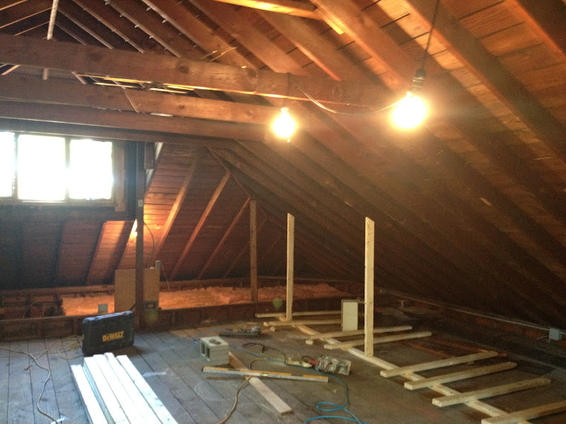
Here are some before shots...


These stairs are being rebuilt
...very steep!

 Space planning and incorporating 
plumbing was quite a challenge 
to figure out...
required several meetings to 
brainstorm with my 
contractor and plumber.

I am also trying to keep this 
project on a budget
which forces more creativity
in my design...
a challenge I love.

I used my preschoolers 
chalk to 
draw out all my concepts 
on the floors... 
(after figuring out plumbing!)

Then spent countless hours
drawing out the 
best way to do the 
space planning to scale. 


 Everyone in my family will have 
a new bedroom.   
My boys will stay down and 
move into the bigger bedrooms 
on the lower level.
My daughter will move 
upstairs with
my husband and me.

Lots of decorating to come!
 Planning on keeping as much 
vaulted as possible...
 My contractor has been sweating 
his tail off with his crew...
He has named this project
"Amy's Fat Farm"
He has dropped several 
pounds working up in 
the hot attic!

Finishing up now on the framing 
of all the walls so will 
show you that next...
will start to make more sense
with what is the space is 
going to end up being.
I was able to get a siting area, 
office space, 2 bedrooms
and a bathroom up here...
very excited! 

Saturday, July 7, 2012

no sew window treatment


I created this 
fun window treatment 
for my son's room 
from a branch, twine, 
small clothes pins, 
and fabric swatches.

I lucked out that this branch 
was just lying in my 
yard after a storm.

I cut the fabric into little triangles
and hung them from the twine.   
I tied the twine to 
each end of 
the branch.  
I left the brackets up from the 
rod to support the branch.

I had to play with the fabric.   
I wanted to have a mismatched 
effect with the fabric 
without them clashing so a 
little rearranging was in order.

This added a great touch 
and personality to his room.


Saturday, June 23, 2012

Kid's Art Display

I'm always getting the 
cutest things home from 
from kids' art classes 
like every mom 
and needed a solution 
for a display 
that could accommodate 
different sizes of art 
and something easy 
to change out.

This idea popped into my 
head while doing laundry.  

I am always thinking and 
wishing I were out of 
the laundry room and 
these hangers caused just 
the distraction I needed to escape.   
Of course...I could not finish 
the load as I needed to 
see this idea in 
action right away!

So simple...3 kids...three hangers

Here is my 
changing art wall:


Monday, June 11, 2012

Add a little kick with pattern

I am always finding fabrics 
that I "have to have" 
somewhere in my home.

Many times, I buy fabric just 
because I love it 
...even if I don't think 
it will go anywhere in particular.

Once I get it home,
I usually have 5 or 6 places 
it can go so end up being 
torn about where to use it.
  
The key to using a loud fabric 
is to use it in the right 
place and in the right amount.


See example below
LOVED this polka dot material.
....Would never use it on a big
piece of furniture.

I did use it on my bench 
cushions in my kitchen...
shown in a previous post.

I don't like to use the same 
fabric twice but I this is 
what happens when you are 
so torn...

so I did also recover this
foot stool with it in the 
living room.


What I love is that this little piece
of furniture has a big impact.
It gives this corner the 
little kick 
it needed.

I topped off the 
brown and cream 
polka dots
with a brown and cream 
accent pillow 
to coordinate the two.

The nice thing is that 
when I get tired of 
these polka dots, 
I used it in a minimal way 
so it is easy to 
change in the future...


However...I think they 
will be here for a while.


Sunday, June 3, 2012

Playing with Space Planning


When working on a space for a client, 
I love to play with things the homeowner has to 
see how things look and flow
to develop space planning.
   
When I am dealing with an empty space,
I use this simple space planner...
These are magnetized furniture pieces
so I can lay things out to scale.

I am not a high tech girl.

The fact can upload and 
blog is a miracle. 

Anyone can appreciate a visual when 
trying to make decisions....
especially when spending money 
is involved.

Below I explored with a family room 
layout to show a client...
had about 5 options before I saw the winner.

Space Planning Wish List:
1.  fireplace to be the focal point
2.  opportunity for conversation 
 3.  as much seating without overcrowding

I started with facing a sofa opposite 
the focal point to balance the space.

One rule I normally start with is to put 
my largest piece on the longest wall....

That rule applied this time..does not always.
(I break my own rules all the time.
That is how you keep things interesting.)

I added a sofa and love seat
rectangular table that follows the 
length of sofa and love seat.
...long side with sofa
...short side with love seat

Was not happy once I saw it
so I kept playing with different options.


Below....This was the winner after exploring.

I liked the clean look with 
two sofas 
and felt like a waste 
to not add a second sofa
when there was plenty of space.

I added a round cocktail table
to compliment the 
length of the couches.

Two sofas also felt
 like a more updated choice
and less predictable.

I liked less tables too to stay 
away from overcrowding.
(An area rug was added 
to connect this arrangement.)

The next step was to shop...
but this is the place to start
space planning....
so important!

Monday, May 28, 2012

Bathroom Tour

A little tour of a little room....
I have featured my 
chalkboard wall on my blog 
before and a little bit 
about this space, 
but thought I'd give
 you more of a tour....

The lighting is a little off...
but I painted the walls 
a medium toned green...mistake paint...
my favorite kind of paint
$8 a gallon
from a thrift store.

I have a plain shower curtain to use 
because this bathroom has 
already been 
7 colors in 5 years...


The window treatment
is a vintage tablecloth
folded and hanging over a
drapery rod. 

The greens are clippings from a 
tree in my yard...
great way to 
feel like you have fresh flowers
but at no cost!


A vintage painting and 
thrift store frame
add the view this 
bathroom is missing....
hung on the chalkboard wall.

You can also see the 
original wall tile
and towel holders.
They were sprayed and recoated 
in white by the
previous owners. 

 Love yellow and green together 
so the window treatment and the 
towels bring in the yellow
 to go with the green 
on the wall.


A vintage wall lamp...
there is an overhead light, 
but I love soft 
lighting options in every room.


Carrera marble for the vanity top 
ties in the marble floors I 
added 5 years ago.

The mirror is decoupaged 
in newspaper. 


The soap dispenser is an old Avon 
lotion dispenser.
The black box stores toothbrushes.

The vintage table has 
the perfect opening for 
towel storage
and a drawer for 
other essentials...

It a tight bathroom so I 
have to use all space in a 
functioning and decorative way...
always my goal in any space.


 My daughter's step stool adds
a little touch of green 
and tucks away 
perfectly under the window.

I changed the knobs on the 
vanity to colored glass
to disguise the Home depot
look it had before.


The wall color shows up a 
little better in this photo.
 A sisal rug is a nice 
earthy touch for the room...
wanted something less 
predictable for the rug. 
Overall...I wanted to make this space feel original... yet updated.
  
tried to accomplish this by
adding vintage furniture and accessories
 to marry with the look 
of the original tile,
adding small tile which is 
the size it would have been originally,
and blending old with new all
the way through.


Monday, May 21, 2012

My Kitchen


 Yesterday was a big day...my home was 
featured on a house walk in 
our town of Riverside IL...still recuperating 
from all the cleaning, painting, rearranging, etc....

My children were allowed back home after the 
event and were asking 
if they could sit on the couch again....poor things!

I thought I would share some photos of my kitchen....

This kitchen was a turn off when I bought my 
home because it was 
so closed off from the dining and living room.   

As you can see in 
the photo below, I opened up the wall and 
added counter stools on the 
dining room side and 
was able to eliminate that issue. 

I added a drum shade fixture that would not
compete with the dining chandelier.

I purchased this antique bread box...
I think new kitchens need old things.


I used a contemporary vase with some artificial
flowers, vintage platters and potted parsley.


The window treatment is an embroidered linen panel 
that I gathered in the center using 
 flower hair accessory.


I glued buttons to this little lamp shade for a touch of whimsy.
The greens in the tall vase are 
from a tree in my yard and 
added some 
lavender and a fern in 
vintage pottery.


I selected custom cherry shaker style cabinets in walnut stain
because I am not too crazy about the red that shows up in wood.
   
I thought off adding white cabinets to keep it as open as 
possible being a galley kitchen, 
but wanted to keep true to a brick bungalow style kitchen.

I base a lot of the way I decorate my home
to fit within the style of the home....
want it to feel original, yet updated.

Sometimes this is hard...I love every style...really!
....but I keep asking...
does this fit with a bungalow look?

I also had to think about how the cabinets would look 
visually with my wood dining set...
not at all into matching, 
but like things to flow.

Sometimes it is nice to ground your design 
with the main elements 
(Example here: cabinets and dining set)
being similar
and then mix it up with how you accessorize. 
   

 I chose these granite counters...giallo ornamental 
to keep the space bright and neutral.

I have an antique wire basket
 for all my potatoes and such...
the open space keeps things from rotting 
and I love the look. 


I get tired of things fast, so I added a 
classic cream crackle
subway tile backsplash
...also true to bungalow decor.

I accented the tile with a travertine
mini subway tile
inset over the stovetop,
It also connects with the floor tile.


Under cabinet puck lighting highlights 
the tile and granite
and is great task lighting.


Then I created a little breakfast nook...
great to have benches for squeezing 
more people in
and I love it with kids.


 I found these plastic vintage flower plaques at a thrift store.
The window treatments are napkins clipped in a row.


I got the bench fabric for $6 a yard...
 just keep recovering and washing
fabric for these foam cushions.

I just wrap them like a present
and use big safety pins.
I added rug grips underneath
the cushions.

I also added vintage doilies under the glass. 


 Found these cool dishes at a thrift store...love the mix of retro with the doilies.

 I stripped the one wall I have to pull the 
colors of the granite and tile.

I placed the stripes over the 
fingerprints of my children
and a mark made where I killed a fly.
...so they are not evenly spaced.
I was too lazy to paint over the top
of the cabinets so 
 this seemed like a good solution. 
 I put the 18x18 floor tile on an 
angle to get away from a runway look.

I also selected a light and bright tile
to keep it as bright as possible and
connect to the colors in granite. 
I wanted a busy
 pattern to keep from having 
to wash the floors too much.

I added some vintage plates in a random way 
to bring your eye up.


 I feel very fortunate to have this kitchen!
I hope you enjoyed the tour!