Sunday, February 26, 2012

Paper craft...so cute!


I was running through the mall to return something and was enticed by a window display at a store called Paper Source.

I went in to inquire and found this 
kit I had to try.

Sorry..can't rotate photo!


 Start with 4 flower cut outs.
 You will need a stapler, glue stick, 
and the 2 circles 
for flower center included in kit. 
 Then you stack the four flowers 
on top of each other.
 Excuse my painted fingers...
Then you crease each petal. 


 Then rotate the petals
 and staple in the center.


 Staple onto a ribbon.

 Glue center to cover staple.

 Then I hung my garland in my daughter's room.


Sunday, February 19, 2012

The Power of Paint


I get excited anytime I see a vintage chair with upholstery in great shape.  I found these chairs that needed a simple change to refresh them...paint. 

I taped off around the 
fabric areas to protect it.


With a coat of antique white paint, some distressing, and a cute accent pillow to coordinate with the upholstery, it changed the entire feeling of the chair.

This chair is currently for sale at Jackson Square Mall in Lagrange, IL for $48.

It would make a perfect addition to a shabby chic decor or a girl's bedroom.


TAKE TWO


A cute accent pillow from Target added after the paint dried finished the look.


So simple for a dramatic new look....

Monday, February 13, 2012

Setting the Mood...with lighting

I admit it...I am a "lampaholic."

I love that lamps act as an accessory 
and they function in a space.

One comment I appreciate that people make when they come to my home is that it feels cozy.
I think this is due to soft lighting 
that I like to use.  

When you have a lamp in your home, you need to think about placement and purpose.   If a lamp is used for reading, you would want to use a 60 watt lightbulb or higher. 
  
If a lamp is used for keeping a room softly illuminated, you can change the wattage to a 40, 25, or even a 15 watt bulb. 

Below I am featuring some areas in my home that are used for soft illumination. 


 I love how this lamp below cascades a leaf pattern on the walls and acts as an uplight. 
This one is near my entry.


This lamp below is on my dining room buffet.  
I love to have lots of candlelight, 
dim my chandelier, 
and turn on this lamp.
   
It creates so much ambiance 
with the combination of lighting sources.


This little accent lamp below has more of a night light affect and I have this 
in my living room.   
I love how the lighting 
affects the artwork too.


Here with the mirror, I actually changed the wattage because it is reflected and multiplied...another detail to pay attention to with lighting.


Look around your own home to see where you can add a lamp or play with the wattage and types of lightbulbs.   It is fun to experiment and compare different lightbulbs and wattages in the same lamp.

Add a little ambiance and have a 
Happy Valentine's Day!

Tuesday, February 7, 2012

Chalkboard Wall


I am always assessing my home decor and looking for things to tweak.   I felt like adding some whimsy with some chalkboard paint. 
My bathroom has a basket weave black and white marble tile floor and thought the black would be a cool accent in that space.

 I initially wrote quotes all over the wall, but got tired of it....so I erased it ...the advantage to a chalkboard wall!

I sketched these flowers
(while my daughter played in the tub) 
by looking at a ceramic rose 
I had as inspiration. 
I added some shading by smudging the 
chalk with my fingers.
 ...Added these little silver birds 
to be in the scene
 And decoupaged this mirror in newspaper to continue the touches of black and white
I like the versatility of this wall and I am sure it will change many times...

Wednesday, February 1, 2012

Sweet Dreams....Creating an Original Doll Bed

I thought it might be fun to show you how I put together a doll bed for my little girl's room. Her room is the most fun room to decorate.

This is a picture of the finished look and I will take you thought the materials 
I put together....
 I started with this bed I bought at a 
thrift store and painted it hot pink...
 I used a standard sized pillow with a cute pillow case for the doll's mattress...
 Then I added a vintage mini throw pillow as the doll's sleeping pillow....found at Jackson Square Antique Mall in LaGrange.
 The bedspread is a dish towel 
from Anthropologie...
 Then I added these mini pillows 
(approx 5"x5")
found at Cracker Barrel and 
a thrift store.
 Then we tucked in the little baby doll 
into her little bed.  
This is an example of my favorite thing to do when decorating...using things in an unpredictable way to create something unique.

Sweet Dreams!

Friday, January 27, 2012

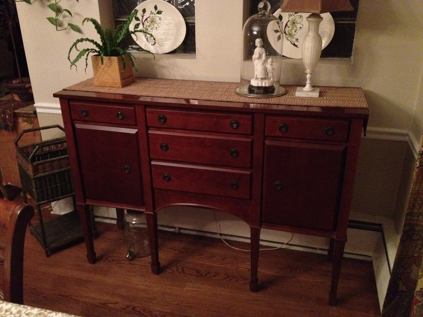
Painted buffet.... before and after

I was looking around my dining room space and thought that things were feeling a little dark and I had too much of the same wood tones all in one room.   

I have a dark wood dining room table and chair set, a dark wood antique chest of drawers, a dark wood bar cabinet and the dark wood buffet shown below. 
See the pattern???? 

I love the mix of different wood tones and painted finishes and thought everything was "matching" too much...not my cup of tea!
  
   The buffet was one of my first furniture pieces my husband and I bought together.   It is 16 years old and a little worn out and felt like the best piece in the group to change.

I asked my husband if he would not mind if I painted the buffet.   He was confused as I am always panting things and I don't think he even notices anymore, 
but thought I would be courteous.
Communication is key to a good marriage.
   
His response was...."What is a buffet?"

Then I was trying to tell him what is is and where it was located, but he looked at me like ...why are you asking...so I got out my paint and got to work.

Before


 I love the painted distressed look of furniture but have to be careful since I live in a brick bungalow.  I don't want it too look to "shabby chic"  I save that look for the bedrooms.   I want it to look like it fits in with 
the style of my home.
So...I chose to do a creamy gold all over and a grey green for the top.  

          
After

 Then I added these mismatched crystal knobs from Anthropologie that have all the colors of the stained glass windows in my living room which is open to the dining room.  
 I distressed the edges a bit by scraping off the dried paint with a razor.
 I love how it turned out... and I am sure my husband will too once he notices it!   

Tuesday, January 24, 2012

Tips for Mixing Patterns and Color


One thing I do the most for clients is assist in coordinating fabrics. I thought I would share a few tips I share with clients that make the process less intimidating.  

Below is a pattern that has what I call "movement."   Patterns with movement have a free flowing effect...
a floral is a good example. 
 Here is another example of a pattern with movement.   I would use these two patterns in the same room.   When mixing more than one pattern that has movement, it is important that they contrast in pattern and scale.   Then they look good together. You use color to connect the patterns...both of these patterns have blue and gold.   

 The next type of pattern I like to add is a pattern that feels geometric.   This could be a herring bone pattern, stripes, polka dots....

 Some patterns are "tone on tone" like the one below.  This one looks solid blue from a  distance...that is a good way to know if you are looking at a tone on tone pattern.  
 Then there are ones that incorporate both a geometric and movement.  This one I would consider to be more geometric because of it's symmetry...but patterns like these can work for either effect sometimes. 
So my general rule is to mix:
patterns with movement
patterns that are geometric
and
patterns that are solid or tone on tone

It always feel more balanced with adding all 3 types into your decor.  These patterns can show up on window treatments, rugs, throw pillows, artwork,and in your accessories.

One rule to remember that when mixing more than one pattern type...add a contrast through color and scale. Also remember to connect the color story by repeating the colors in your fabrics. 

Hopefully these tips will help when mixing patterns and colors....
This is one of my favorite things to do!


Friday, January 13, 2012

The Need for Green......


I am not the gardening type...hate bugs, but I do love plants and flowers.   When all the green is gone from the trees, I have to go out and buy some new plants for inside my home.  

I had a glass bowl, a rusted lantern I picked up at an estate sale, and hit our local florist for some small plants and one fern.


 I planted the fern in an old bowl I had and placed the lantern in the center.  The lantern has a long screw sticking out from the bottom which is what started the idea of adding to a plant.  All I had to do was 
stick it in the dirt.
 Then I added a cream candle in a 
shallow candle holder and placed it 
inside the lantern.


 Next I added 3 different smaller plants in one pot to create a simple arrangement. 


 Then I worked on my favorite idea.
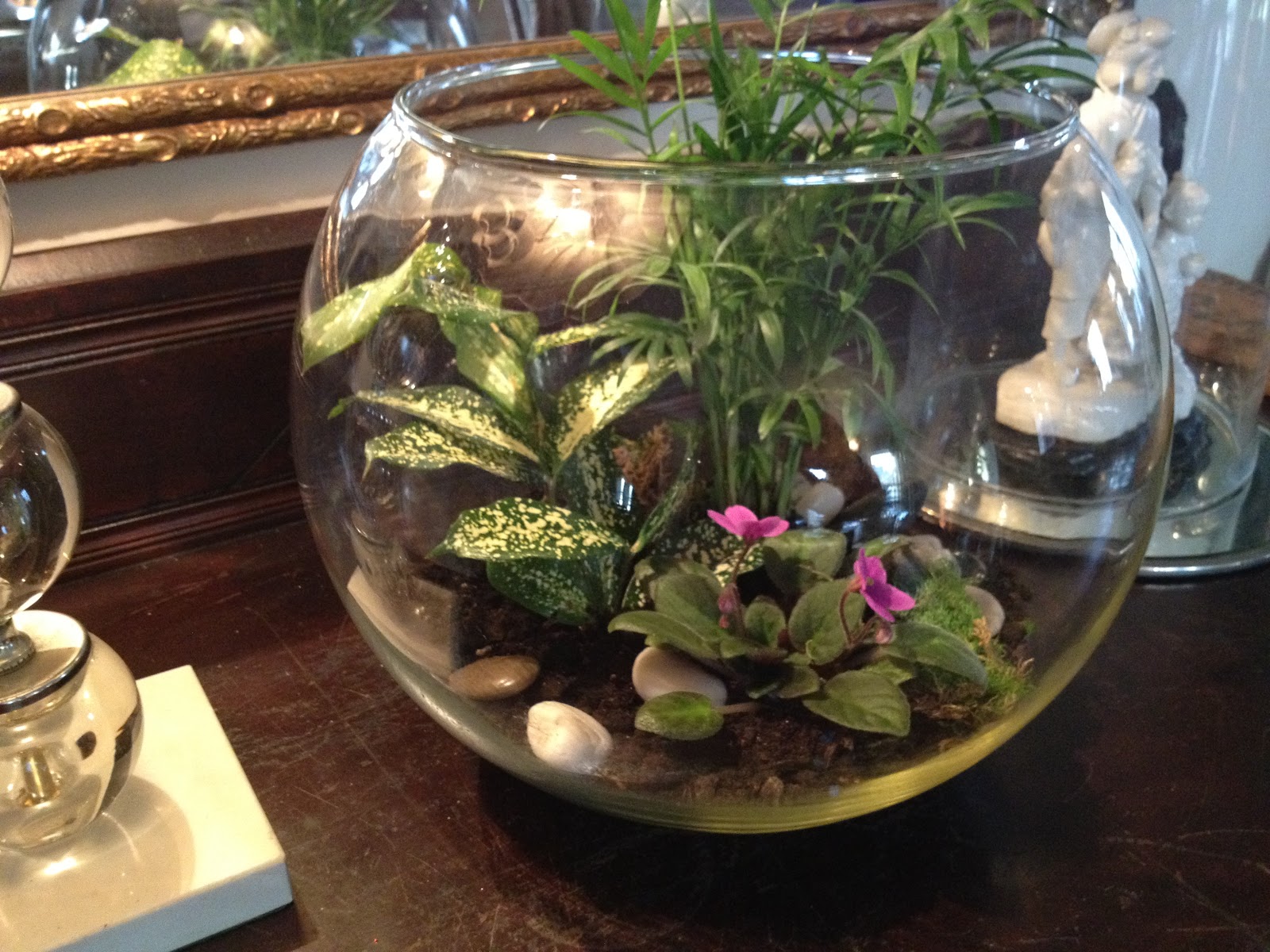
I found this florist in Paris through Pinterest that makes terrariums that are so sweet.  I was thrilled when I found a oversized glass bowl at a thrift store for $3 so I could try it myself.


It was so simple...I added 2 small plants purchased for $1.45 each and one miniature African Violet that cost $3.

I mixed the height, color, and textures of the greenery to make each plant stand out.

Then I added some river rocks and 
litle bits of moss.


Having the green back and these 
sweet little flowers 
makes me feel happy!